Monday, March 12, 2012

Exibit in Roanoke, VA


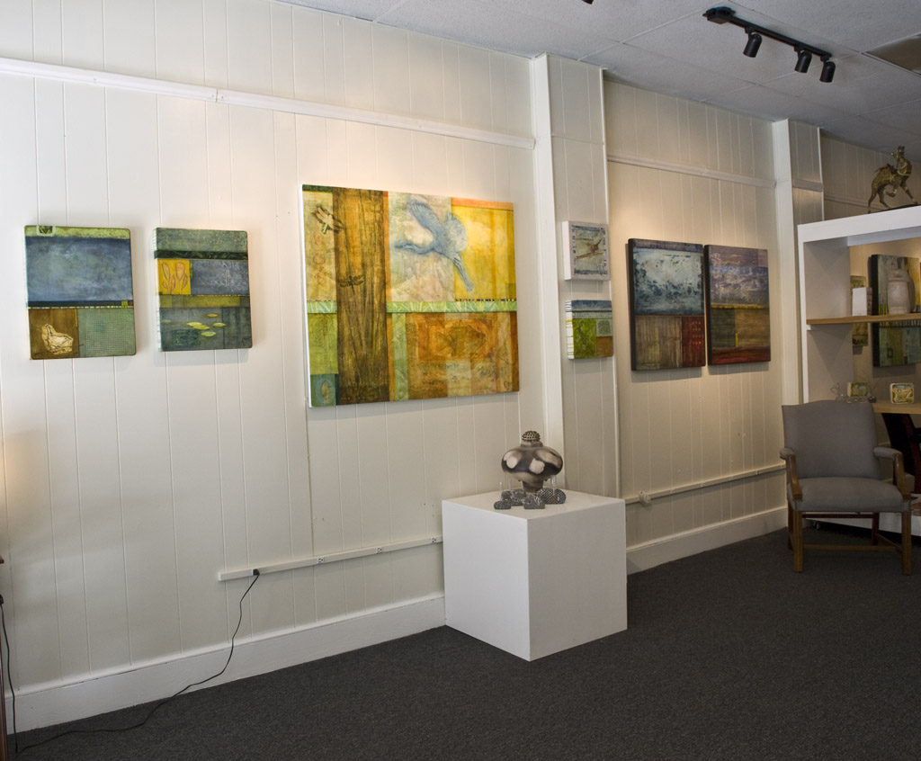
I recently traveled to Roanoke, VA to install an exhibit of my work at Gallerie Francois II. I had not been to Roanoke before and was pleasantly surprised to find a very nice section of galleries and cafes, along with a gem of an art museum, downtown near Galerie Francois. The official opening is not until April 6 during the First Friday gallery walk. We installed the show early because of scheduling issues. I have to thank fellow artist and friend Helene Steene, also from Lexington, who introduced me to the gallery and helped hang the show. She has some beautiful pieces hanging in the gallery as well. And of course, much gratitude goes to Francois Tor, for giving me the opportunity to exhibit in his gallery.
Galerie Francois II
133 Campbell Ave SW
Roanoke, VA 24016
540-561-0925


Tuesday, February 07, 2012

Outside My Window


Fresh from the oven, 23" x 24" acrylic, Tyvek pastel and mixed media on panel. No tile yet - although the title of this post is a good candidate.

I've been trying to paint more from personal everyday experience. All the Humming Birds have arisen from an "encounter" I had last summer. It all turned out OK, if a little startling. I was watching one from my doorway when it turned and zoomed, in three short spurts, to within about four feet of my face. We both paused for about 10 long seconds, then he was off. Makes you wonder - which is kind of a main point of my paintings. The Passion Flower Vine grows on the fence behind the Scarlet Sage the bird was sipping.

Saturday, January 21, 2012

notBIG

"Sage: Variation 2"
"Bridge Beneath The Moon"
I'm pleased to have two pieces in this show at the M S Rezny Studio/Gallery, 903 Manchester Street, Lexington, KY. Dates are January 9th - February 3rd, 2012. The exhibit is definitely worth seeing.

Photos of the Gallery and pieces can be seen here 

Quoting the the exhibit statement:
"The juried exhibit, notBIG a small art competition, features works in any media that is no than larger than 12 inches in any direction. Jack Girard, a professor of Art at Transylvania University, served as juror. notBIG generated 381 submissions from 112 artists, spanning 32 states and 8 countries. Girard selected 62 works for the exhibit.
Girard believes that, 'the works here represent current trends in some arenas of picture/object-making... I think we have here a dense, exciting, and intense exhibition of real gems-first-rate works that insist on a rather intimate relationship between artist and viewer.... These are small works and there are a lot of them, but they are nonetheless monumental in conceptual and emotive power.'"

Friday, December 02, 2011

Owensboro Museum of Fine Art

 "Water Garden 1"
Acrylic, Tyvek, and pastel on panel
39.5" x 36"


I am fortunate to have this painting included in the exhibit “River Country 2011”, at the Owensboro Museum of Fine Art in Owensboro, Kentucky. The dates are Dec. 2 - 31.

This is a national juried competition sponsored by Owensboro Medical Health System to acquire works of art for the hospital’s new regional medical facility.

From over 700 entries, 60 works were selected for exhibition by juror, Peter Morrin, Director Emeritus, JB Speed Art Museum, Louisville.

Saturday, September 24, 2011

Recent Work

I've been doing a lot of birds lately. I'm moving toward including more representational elements in larger mostly abstract work, but I'm enjoying these small studies on their own. They bring together several techniques I've been trying to combine for awhile. All are 12 x 12 in. wood panels.


Friday, July 15, 2011

Looking and Drawing

I've been drawing more (and posting less) lately. I'm still looking for a way to combine some of the techniques I've used in the past into a new synthesis. Creativity, in my opinion, is not really about making anything new - all the elements and principles and potentials are already in place. But as we explore new ways of relating and perceiving we create an inner experience of both cause and effect. We just happen to leave bits of physical evidence here and there.

But that is getting beyond the subject of this post. All this searching I've been doing has put a serious crimp in my painting productivity. So I'm looking to drawing to get back in the flow. Drawing is a great way to focus your attention outside of yourself.

This drawing was done with sumi ink using crude split-reed brushes and pens that I make from dried grasses and bamboo. Broader washes are done with a traditional Chinese calligraphy brush. It's one of my favorite techniques. I love the unpredictability. And I think crows are pretty cool too. The second version is digitally colored and composited with part of an old painting for the background.

Some of my ink drawing tools

Friday, May 20, 2011

Changes


Winter Water #1
This is not an entirely new piece but I have made changes in the upper right corner and feel it is much stronger now. You can see the previous version a couple of posts back.
I am searching for a direction to create a new body of work. This is very close to where I want to go next. I would still like to incorporate more representational elements though. The challenge is to successfully integrate the grid structure and abstract patterns and gestures with recognizable figures and objects. My intention is to create dreamlike experiences that can be summoned at will for personal reflection or the simple enjoyment of exploration.

Tuesday, November 30, 2010

Art and Horses

Living in the "Horse Capital of the World" a lot of things get connected to horses, and art is no exception. Even though I am not an equine artist, I am fortunate to have recently been be a part of two local fundraisers that have horses as their theme. Horsetails was initiated to raise money for the Lexington Philharmonic Foundation's Partners in Education initiative and took place during the recent World Equestrian Games. It was an intriguing concept with an exciting range of top notch artists contributing. I recommend you go to the www.Horsetails2010.com website to read about it and see the art.

Horse Mania 2010 has been going on for months and is about to reach its climax with the live auction this Friday at the Keeneland Sales Pavilion. This is the same facility that hosts the sales of some of the racing worlds top thoroughbreds. The event is organized by LexArts, and proceeds go to many local charities. Again, I encourage you to visit their website www.HorseMania2010.com for a look at an amazing menagerie.

An added bonus with both events was the publication of an excellent book. I feel privileged to have been included.

Horsetails book cover and my two-page spread


Wednesday, October 13, 2010

Water Series

"Winter Water"
acrylic, Tyvek and pastel on panel
29.625" x 32.675 "


I've been busy with several projects lately, including local fund raisers Horsemania and Horsetails . More about those later. For now I'm uploading the latest in my "Water" series. I'm still finding lots of room to explore with this theme. Current works are tending more toward the abstract.

Saturday, August 14, 2010

Water Gardens

"Water Garden 12"
acrylic, Tyvek and pastel on panel
18" x 18"


This is the final piece for the New Editions Gallery exhibit next month. I'm excited about the way the grid composition has evolved. And thinking about this series last night I started getting a clearer idea how representational elements might be incorporated in the future.

Thursday, August 05, 2010

Water Gardens

"Water Garden 11"
acrylic, Tyvek and pastel on panel
18" x 18"


This painting is a little larger than the last four in this series. "Water Gardens" is actually a subset of the "Water" theme I am exploring. I'm curious to see where it all goes. I can see both more abstraction and the addition of figurative elements as possibilities. The idea is to keep the subject as a focal point, interspersed with other series, until it seems time to let it go.

Sunday, August 01, 2010

Water Series

"Water Garden 10"
acrylic, Tyvek and pastel on panel
12" x 12"

I am continuing to develop work based on the theme of water. These four small pieces will be part of a group exhibit at New Editions Gallery in the Fall.

As I have mentioned before, water is fundamental to life on this planet, yet we often take it for granted - especially in the developed world. Because we are so connected to this simple molecule we ignore our mutual dependence to our own peril. When we do take notice, it can evoke both beauty and fear. This psychological tension is part of the power of our relationship to water - a seemingly endless source of inspiration, metaphor and myth. Yet, as with all things pertaining to life, the sustaining principle is balance, which I believe is best nurtured through awareness and appreciation. My hope is that these works can be received and enjoyed on simple experiential terms as well as serve to draw attention to the ideas I am exploring with them.

Stylistically I have taken multiple aspects of the subject, from microscopic views to abstracted patterns, and juxtaposed them in the same plane. The effect I'm after is a broad meditative impression with many potential passages of attention, rather than a single focal point or narrative. The compositional device of an asymmetrical grid holds the varied elements together and further states the message of dynamic balance.


Tuesday, April 27, 2010

Water Series

"Water Garden 2"
acrylic and Tyvek on panel
33" x 51"


This is the second in the "water" series. I have also finished three smaller pieces in this series since. I'm happy to say The University of Kentucky Hospital has asked for two of them for their new facility.

Monday, April 26, 2010

Current Exhibit

Here are a few shots from the current two-person show at Logsdon 1909 Gallery in Chicago, IL, and the joint statement:

SUBTEXT

Information is a hallmark of our age. And whether intentional or imagined, every exchange of information carries multiple layers of implication and interpretation. In these two diverse bodies of work, found object constructions by Lucinda Alston Chapman and acrylic and Tyvek paintings by Philip High, both artists have lifted elements from the vocabulary of form and function we typically associate with written communication and reassembled them into new visual syntax. In this context, once familiar symbols become abstracted and are more about potential than point. From alphabet blocks and carved books to undecipherable script and dissected letter-forms, our graphic expectations are playfully subverted and reveal the deeper subtexts of imagination, perception and subjective relationships.

You can see more pictures at Flickr.


Tuesday, March 23, 2010

Water

"Water Garden"
acrylic and Tyvek on panel
39" x 32"

This is the first in a new series of paintings. The subject of water has unconsciously emerged in my work many times over the years so I have decided to address it directly. Water is such an integral part of our lives, and life in general, that we take it for granted, to our own peril. These meditations on the beauty and mystery of water are meant to explore it's relationship to our physical, emotional and spiritual selves. Hopefully they will also help inspire and cultivate an appreciation for our dependence on the availability of this simple yet powerful substance.

This particular painting was based on a photograph I took at the University of Kentucky Arboretum, a wonderful botanical garden I am grateful to have nearby. I have included the original photo and my digital "sketch" to illustrate how I might develop an observation into an abstraction. I am also pleased to announce that this piece will be featured on the "Happy-Place" website, a design/lifestyle online store opening later this Spring.

Sunday, February 14, 2010

Even More "RED"

The red theme seems to have grabbed my imagination. I actually started this piece last year but was never completely satisfied with it. After some extensive reworking I think it's finished now. The title is "Atmospheric Sequence I" and it represents an idea I've been interested in for some time, putting together multiple views of the same "scene" with slight variations - like frames from a movie that suggest the passage of time. They are temporarily held in suspension for individual examination, but also merge into one dynamic, if indefinite, stereo "field," forever flickering in the imagination between two slightly out of phase points of perception.
"Atmospheric Sequence I"
Acrylic and Tyvek on two attached panels

Wednesday, February 10, 2010

More "RED"

This painting is also going in the "RED" exhibit at Mary Rezny's. The title is "Sensory Data Array 02" and it was actually done awhile back for an exhibit at Logsdon 1909, in Chicago. The obvious connection here is the color. The piece is part of a series in which I am exploring the juxtaposition of chaos (free gesture) and order (pattern). A portion of the first painting in the series is used as the header background for this blog. The other three pieces can be found on my portfolio website www.philiphigh.com.

For me, painting is part pure sensory enjoyment, part puzzle-play and part contemplation point. While some artists purposely distance themselves from titles, I like to provide some clue as to what I was thinking before, during or after the process. Or simply offer a suggestion as to where someone else might start their exploration. But I also try to keep the titles cryptic enough to leave room for interpretation. The image isn't meant to illustrate the concept but to serve as an anchor point for individual experience. Plus, I like words almost as much as images and just enjoy the added resonance.

In the case of this series, the titles carry the same pairing of concepts as the images - "Sensory" for the raw color and gesture and "Array" for the ordered grid pattern. The word "Data" suggests the computer-centered world of tools and knowledge (technology) we have built around ourselves for protection against the limits of our understanding and the potentially overwhelming forces of nature. I know, it's a lot to read into a simple arrangement of colorful circles. It's not mandatory for enjoyment, but it's there if you want it.

painting - "Sensory Data Array 02"
acrylic and Tyvek on panel.

Friday, January 29, 2010

New Work


Friend, artist and photographer, Mary S, Rezny, is having an invitational exhibit in her studio in a couple of weeks. The title of the show is "Red." My take on the theme is this recently finished piece which I've called, "Sailor's Delight." The reference is two-fold: first the weather aphorism "Red sky at morning, sailor take warning. red sky at night, sailor's delight," second, the row of light dots in the lower right resemble harbor lights. I sometimes struggle with titles for abstract paintings. There are always the risks of being too literal, or too esoteric, or too... cute. I usually wind up making some reference that I feel gives people a starting point to engage the painting. I'm not really so concerned where they end up though. If someone finds their imagination and emotions activated by the piece, that alone is a good thing. Especially if they are unaccustomed to looking at the world this way. My goals are to challenge and reward viewers in a ways that are both intellectually stimulating and emotionally satisfying. No, it's not cutting edge, but I'm still finding lot's of room to explore here. Hopefully others will too.

This is a small piece, only 9" x 10." The medium is acrylic and Tyvek on a wood panel.

Tuesday, January 26, 2010

Concrete

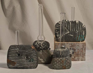
These quirky little objects, the tallest of which is about 7," were recently donated to a local (in my neighborhood, actually) not-for-profit organization, The Living Arts & Science Center (LASC), to be included in their annual art auction fund raiser. Donating art to charitable auctions is a sometimes contentious subject among artists and deserves a discussion of it's own. Since this writing is about the art work, I'll leave that for another time.

I've been intrigued by concrete as an art medium for several years and belong to a Google Group called Artconcrete that discusses the subject. The group was started by Canadian artist and jeweler, Andrew Goss. Check out his blog at http://artconcrete.blogspot.com/ for information and links if you are interested. He's done a great job of showing the potential for the medium, including writing a book geared toward small scale work, titled "Concrete Handbook for Artists," also available through his web sites.

The bud vases were some of my first experiments and I had tons of fun doing them. Along with concrete, they incorporate found laboratory glass (I'm a hopeless scavenger treasure-hunter), tile grout, copper leaf and wire and a chemical patina. Maybe I can go into the process more another time. I kept to a smaller scale both for manageable experimentation and practical working conditions. Everything was done in my regular painting/design space where setup and clean up are major issues. Concrete dust and buckets of water are not entirely compatible with paint, paper and computers! I've sold several through galleries in Lexington and Chicago but this is their first really public outing. Unless you count the ETSY store that I neglected into auto-extinction.
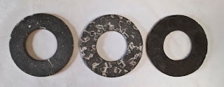
The 6 6/8" diameter rings in the photo to the right were among my first trials. No other use for them has been found to date, but I'm looking! The shape resulted from found plastic packaging that I used for a mould. The colors are from different pigments , aggregates and finishes.
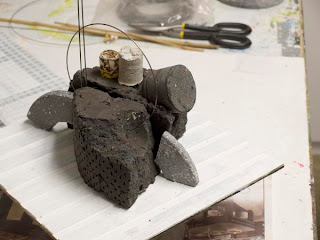
In the last photo, an ancient-future, radio-wanna-be, rock-boat, is just a playful temporary construction made from pieces of my first disastrous attempts with concrete. TIP: make plenty of room for failure, it's so instructive - and can be fun!

Saturday, January 23, 2010

Evolution

Here is sequential look at the evolution of a digital/traditional hybrid piece. The steps were not preplanned. The process was an experiment with no particular end in mind except discovery. Some might see that as a metaphor for life I suppose. In any case, I enjoy watching things grow. I'm not sure what to do with this particular species. A poster series maybe? I'm open to suggestions.

Click images to enlarge

1) I started with a ballpoint pen sketch, one of my favorite mediums.
2) After scanning, I converted it to vector art and posterized layers in CorelDraw. Not much difference visually but an important technical step.


3) Then I exported it to a Photoshop file, opened it in that program and tried some color. Since I had separated the various shades of gray into unique layers in step 2 I could easily alter their colors individually.
4) A little filter magic - OK, a lot!


5) Finally I scanned part of a painting for the background and recolored it to harmonize with the rest.